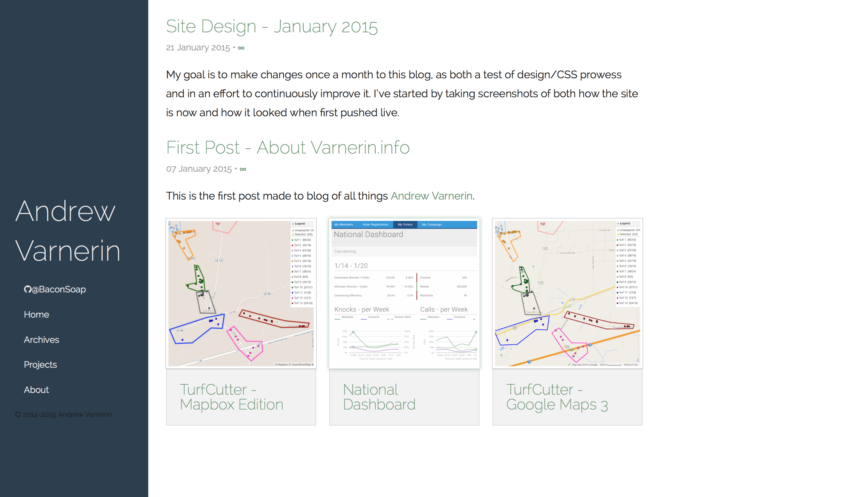
My goal is to make changes once a month to this blog, as both a test of design/CSS prowess and in an effort to continuously improve it. I've started by taking screenshots of both how the site is now and how it looked when first pushed live.
I used a number of resources as reference for how I wanted my site to look. The overall layout - fixed left nav bar, with scrolling content to the right - is becoming popular. I went and made the side bar convert to a top bar on smaller screens, too, in an attempt to make it very readable on a mobile device. I also decided to put a few choice projects on my front page, beneath the posts listing.
Design References:
- fooforge a blog I stumbled on from the Jekyll site directory
- Ean Moody having recent projects on the front page
- Kevin Marsh Another dev blog - I like the narrower padding on the main content
- BrettTerpstra The larger font and spacing made reading easy - my font is slightly smaller
Then and now: